For example:
Jack & Jill
Went Up the Hill
To Fetch a Pail of Water
Jack Fell Down
And Broke His Crown
And Jill came Tumbling After
Visually convey the nursery rhyme as simply as possible, using only symbols, letterforms and/or dingbats – no words or representational imagery.
You may however use design treatments such as blurring, gradations and transparency to convey movement and space.
You may however use design treatments such as blurring, gradations and transparency to convey movement and space.
The final design will be in two formats:
* A seven panel accordion book (6x6") with the title of nursery rhyme as the first panel.
* A single panel poster (16x20") or a 3D sculpture.
Final design will be both digital and printed on the Epson printer in the digital lab.
Final design will be both digital and printed on the Epson printer in the digital lab.
Schedule
Project Launch Tuesday, November 24th
• Work in Class
- Nursery Rhyme Selected
- Three Thumbnail Roughs Completed
Tight Design Rough Due Tuesday, December 1st
• Critique
• Work in Class
Design Comp Due Thursday, December 3rd
• Critique
• Work in Class
Laser-proof Book Dummy Due Tuesday, December 8th
• Critique
• Work in Class
ATTENTION
Strive to make this your strongest design of the semester.Final Printed Book Due
Final Nursery Rhyme Book Due Thursday, December 10th
This project has progressed along well, so as a class reward the due date and FINAL PRESENTATION of the Epson printed Nursery Rhyme Accordion Fold Book has been changed to 2:30 pm, Thursday, December 10th.
Along with the Epson printed accordion-fold book, post the final design on your blog as well.
Strive to make this your strongest design of the semester.Final Printed Book Due
Final Nursery Rhyme Book Due Thursday, December 10th
• Final Critique
• Last Day of Class
• Last Day of Class
_________________________________________________________
The following partial example did NOT get an A.
It most likely could have with a bit more exploration and work.
The following partial example did NOT get an A.
It most likely could have with a bit more exploration and work.


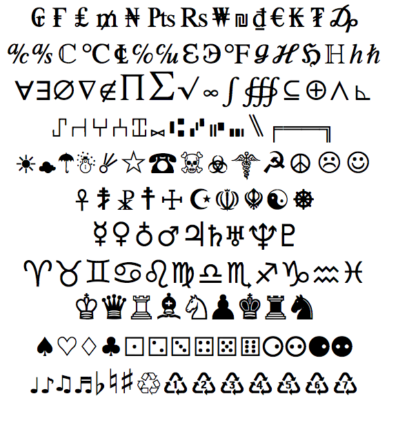
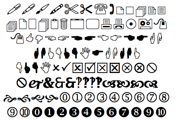
I went through Font Book on the computer at my studio and gathered the samples of alphabet fonts, symbol fonts, and dingbat fonts that would be permissible to use on this project. There are also many other possibilities that I have not posted including map symbols and highway signs, etc. If you absolutely have to use pictographs to come up with a good design, you may use the official US NPS and Forest pictographic fonts. You may also use logo marks, but if you go that route, stay with logos, but no logotypes. Lastly, if you really need to punt, I suppose you could use emoticons as a last resort.