@Stake Campaign Review by Client


Hey Larry, 

We’re all inspired by the work your class did and the potential they uncovered for us.
Our next step is to raise the $$ required to get this out into the world. WE plan on partnering with different companies (I met with local Patagonia people yesterday) and organizations (350.org is thinking of how to best use the @stake concept). Ideally we'll gather many, many @stake stories for our website, instagram, FB, and Youtube platforms. We'll catagorize the input input into communities and gather resources for these communities hoping that new action materializes.
I'll keep you posted as to our efforts and hope to maintain this relationship with you and your great Design Students. Thank you for the opportunity to work with you.

Brooke Williams
Great West Institute


@Stake Campaign Presentation Feedback

There are a number of common elements included in each of the proposals; I particularly enjoyed comparing the descriptions and designs. There are elements from each presentation that are very helpful for us as we put together our work plan, budget and next steps I was also particularly interested in the text/rhetoric used to explain design and campaign elements.  
.

In terms of logos, there are a few that I was drawn to, with one clear winner (shown at right) I also liked the exaggerated perspective stake/exclamation point logo. Perhaps worth exploring some hybrid of the two.

This same proposal included a few elements that are helpful for us, including the 3 Phase Implementation plan. The plan is helpful in populating the task list, but could benefit from some ground trothing consultation with some professional outreach/marketing experts. Budget should be included and a timeline would be extremely helpful.

I also really liked the overview page, which showed all the elements on one frame. I found this to be a useful checklist as I sought to narrow what we have the resources to work on. This is also helpful for phasing/timeline purposes.

The phrase used on the website page of this proposal: “Everyone has a share in the environment. HOW WILL YOU INVEST YOURS?” I don’t feel like this tagline quite resonates. It is also potentially limiting audience by using the term “environment”.

I am a bit ambivalent about the swag page, unless we can provide a way to customize their t-shirt/sticker with their stake. Otherwise, not sure there will be adequate interest up front. Could be wrong.

I like the app idea; feel that it would complement the website for mobile users; also think the sense of place that this campaign can contribute to is one of its biggest assets, so we should make that a center piece. We still have some work to do to explain why people should sign up.I also liked the team pass the stake’s idea of developing a filter for posting that placed the stake in a photo if you were using an app.

The pass the stake team was fairly effective in the text they used to describe the task at hand and how this product can be used (Bring Awareness by…, Educate…., Excite..., Encourage Participation, Collective Synergy brought about through….) Particularly resonates on the page with website description. I feel this team thought through the causal links of this tool and the potential impacts. 

The @stake proposal that had the logo with trees had some compelling design ideas for website, including infinite scrolling website design. It also listed the other key elements that should be incorporated into the home page including a popup subscribe box, a brief video explanation and easy access to make a #stakement. The idea of calling individual posts “stakements” was offered by more than one group. I wasn’t comfortable at first, but I think it is worth a discussion as a component of the @stake brand.

The team with the hand and stake has some strong descriptive language, however the logo for this group is a bit extreme and aggressive. While I personally identify with the concept, the message it communicates is a bit off and exclusive. The overview of this group included creating “an online personality that keeps viewers interested and coming back for more. This is a nice way of talking about it.

Another proposal demonstrated a nice website design (see below) worth comparing side by side to the infinite scroll. I was really drawn to the right hand image, which models what an individual “stakement” video/caption might look like.

One of the proposals included a recommendation of Meetups. As a means for providing greater value for our members and augment virtual interactions, I think this is a compelling concept for us to pursue.

I am a bit ambivalent about the swag page, unless we can provide a way to customize their t-shirt/sticker with their stake. Otherwise, not sure there will be adequate interest up front. Could be wrong.

The concept of acquiring and wrapping a van with advertising is a bit beyond the scope of our current means and likely not the most effective use of funds, however, I think offering it as a concept is helpful to get more of us thinking outside the box.

Numerous groups recommended a target audience of 18-30 yr olds. This focus on millennials makes a lot of sense for an organization like ours that seeks to empower change leaders.

In a few of the proposals, there was too much emphasis put on the environmentally sustainable materials (important, but not a priority talking point). 


WASTE Poster Final Print File

The final WASTE poster print file specifications are one or both of the following:

Final Print Size:
30 x 40"

PDF File:
Hi-res 30x40" @ 300DPI, CYMK with embedded fonts

JPEG (or TIFF)
Hi-res 30x40" @ 225-300 DPI, CYMK

Due:
Tuesday, December 1st, beginning of class

P-5 Less is More Nursery Rhyme

Recall a favorite nursery rhyme from childhood which can easily fit into six stanzas. 

For example:

Jack & Jill 
Went Up the Hill
To Fetch a Pail of Water
Jack Fell Down 
And Broke His Crown
And Jill came Tumbling After

Visually convey the nursery rhyme as simply as possible, using only symbols, letterforms and/or dingbats – no words or representational imagery.

You may however use design treatments such as blurring, gradations and transparency to convey movement and space.

The final design will be in two formats:

* A seven panel accordion book (6x6") with the title of nursery rhyme as the first panel.

* A single panel poster (16x20") or a 3D sculpture.

Final design will be both digital and printed on the Epson printer in the digital lab.

Schedule

Project Launch                                                           Tuesday, November 24th
• Work in Class
   - Nursery Rhyme Selected
   - Three Thumbnail Roughs Completed

Tight Design Rough Due                                          Tuesday, December 1st
• Critique
• Work in Class

Design Comp Due                                                     Thursday, December 3rd
• Critique
• Work in Class

Laser-proof Book Dummy Due                                Tuesday, December 8th
• Critique
• Work in Class

ATTENTION


This project has progressed along well, so as a class reward the due date and FINAL PRESENTATION of the Epson printed Nursery Rhyme Accordion Fold Book has been changed to 2:30 pm, Thursday, December 10th. 

Along with the Epson printed accordion-fold book, post the final design on your blog as well.

Strive to make this your strongest design of the semester.Final Printed Book Due                                              


Final Nursery Rhyme Book Due                                 Thursday, December  10th
• Final Critique
• Last Day of Class

_________________________________________________________

The following partial example did NOT get an A. 
It most likely could have with a bit more exploration and work.


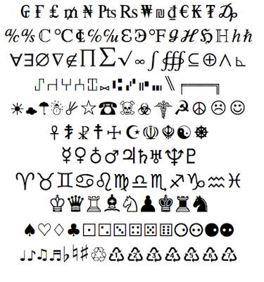
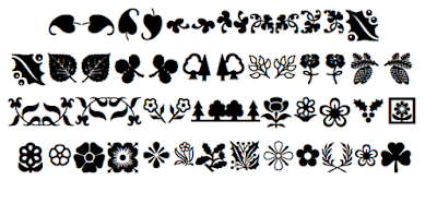
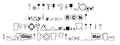
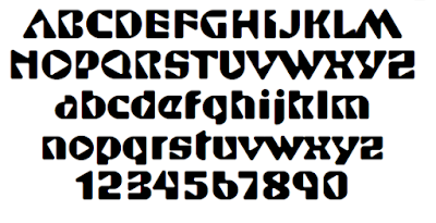
I went through Font Book on the computer at my studio and gathered the samples of alphabet fonts, symbol fonts, and dingbat fonts that would be permissible to use on this project. There are also many other possibilities that I have not posted including map symbols and highway signs, etc. If you absolutely have to use pictographs to come up with a good design, you may use the official US NPS and Forest pictographic fonts. You may also use logo marks, but if you go that route, stay with logos, but no logotypes. Lastly, if you really need to punt, I suppose you could use emoticons as a last resort.


P-4 @STAKE: Social Media Campaign

@STAKE is a public venue for expressing your expressing your personal concerns for the future. Originally conceived by author and environmentalist Brooke Williams as means of connecting individuals concerned with climate change and the planet's environmental future, it has expanded to include any heart-felt concerns of community-minded individuals.

Phase One
The first phase of the project is to create a personal "Stakement" using an "@STAKE stake”, regarding an issue you believe is of the utmost concern or ”at stake” for the future. 
The Stakement can be verbal or visual, written or drawn, recorded or video-taped, but must include at the minimum an image and a statement.

Phase Two
The second phase of the project is a group project. You will need to research, investigate and design a social media campaign to launch, present, promote, receive, display, and communicate the @STAKE concept and STAKEholder  STAKEments. The campaign may include, but is not limited to: a website, an app, a Instagram site, a YouTube channel, and a Facebook page.

Project Schedule

Project Launch  – Tuesday, November 3
- Meeting w/ Brooke Williams
- Work in Class

Campaign Project Brief Due, Thursday, 
November 5
- Project Brief Discussion
- Work in Class

Personal @Stake Stakement Due – Tuesday, November 10
- Critique
- Work in Class

Campaign Comp Due, Thursday, November 12
- Critique
- Work in Class

Final Campaign Due – Tuesday, November 17
- Critique
- Work in Class

Campaign Presentation – Thursday, November 19
– Meeting with Brooke Williams

P3 - Waste Poster Project

Designer as Author – Waste Poster

Several years ago, the Provost launched a new campaign to make WSU and the Ogden Community more aware of environmental concerns which affect our daily lives. These important environment issues are now part of WSU’s Engaged Learning Center (ELC) program, and themes for their annual Engaged Learning Series – http://www.weber.edu/ccel/els.html.Last year’s theme was “On Water” – and included a variety of presentations and projects campus-wide which disseminated information and issues regarding water and its relationship to us. This year's theme is “Waste.”This design project includes participation with this initiative and concern.You will research and collect information about WASTE and how it affects us personally and our daily pursuits, then create a information graphic/poster that can hang in the Bridge Gallery in the Union Building.

This project also fits with two significant and timely approaches in the design profession today – “Designer as Author” and “Design for Good.” A “Designer as Author” approach emphasizes the creation of content as well as form, and its outcomes are aimed directly for a marketplace of goods and ideas. The prestigious School of Visual Arts in NY offers an MFA program in this design approach – http://design.sva.edu/, and it has also been a timely topic on many design forums the last ten years –http://www.eyemagazine.com/feature/article/the-designer-as-author. A “Design for Good” approach emphasizes the implementation of design thinking for social change. The AIGA created this platform several years ago to support and sustain designers who play a catalytic rule in communities through projects that create positive social impact – http://www.aiga.org/design-for-good/.This project is also a vehicle to introduce you to problem/solution design methodologies. A score of the most prevalent Design Methodology is also found on this class blog under Class Content. 

Poster Objective:

To raise awareness, improve person behavior, and increase public engagement around the issue of “Waste”, exploring it thru the prisms of culture, economics, education, health, politics, environment, 
or design.

Poster Requirements:

•  The poster must be informative, statistical and engaging.

•  The poster must incorporate at least one significant statistic. The statistic must come from a credible “academic” study, which needs to “referenced” on the poster.

•  The Designer's Name, along with the Reference will be set in san serif, regular weight, all caps, 10 pt type, with two spaces before and after a vertical bar (pipe) character between each.

•  At best the reference will have been “published” in a peer-reviewed academic journal with the reference listing the following CMS format: Author's Name, Paper Title, Book Title, Publisher's City: Publisher's Name, year.
At minimum, reference the web site url the statistic was gleaned from, with the statistic’s study name, author, and year.

•  The poster must incorporate at least one significant responsive course of action.

•  Final Poster Size- 30x40; Final Poster File - 300 dpi, high-res, CYMK jpeg, tiff or pdf.

•  A half-size (15x30) printed version of the poster (use Epson 4000 in lab) will due 10/28.

•  The final hi-res digital file of the poster burned onto a “labeld” CD will due 11/3.

•  A 30x40 printed version of the final poster design will be hung in WSU Union Bridge
   Gallery during the 2016 Intermountain Sustainability Summit next spring.

Project Schedule

Content Due Tuesday, October 6

Concepts Thumbnails Due, Thursday, October 8

Design Roughs Due, Thursday, October 15

Design Comp Due, Tuesday, October 20

Final Design Critique, Tuesday, October 27

Final Printed Design Due, Thursday, October 29
- 15 x 20, Printed on Epson 4000

Final Design File Due, Tuesday, November 4th
- 30 x 40, 300 DPI, JPEG or Hi-Res Print PDF


P2 - Domestic Abuse Awareness

Design a Domestic Abuse Awareness Poster

•  Posters should be graphically attractive and use a dynamic message
•  Must not include violent or sexually graphic images
•  Must depict the theme, “Love looks like…”
•  Must be able to be printed on 11x17 paper
•  Must be original, any copyrighted images/materials must have release forms
•  Must incorporate “Safe@Weber” logo somewhere in the poster

Final Poster Due Thursday, October 1st.